Mobile Standards
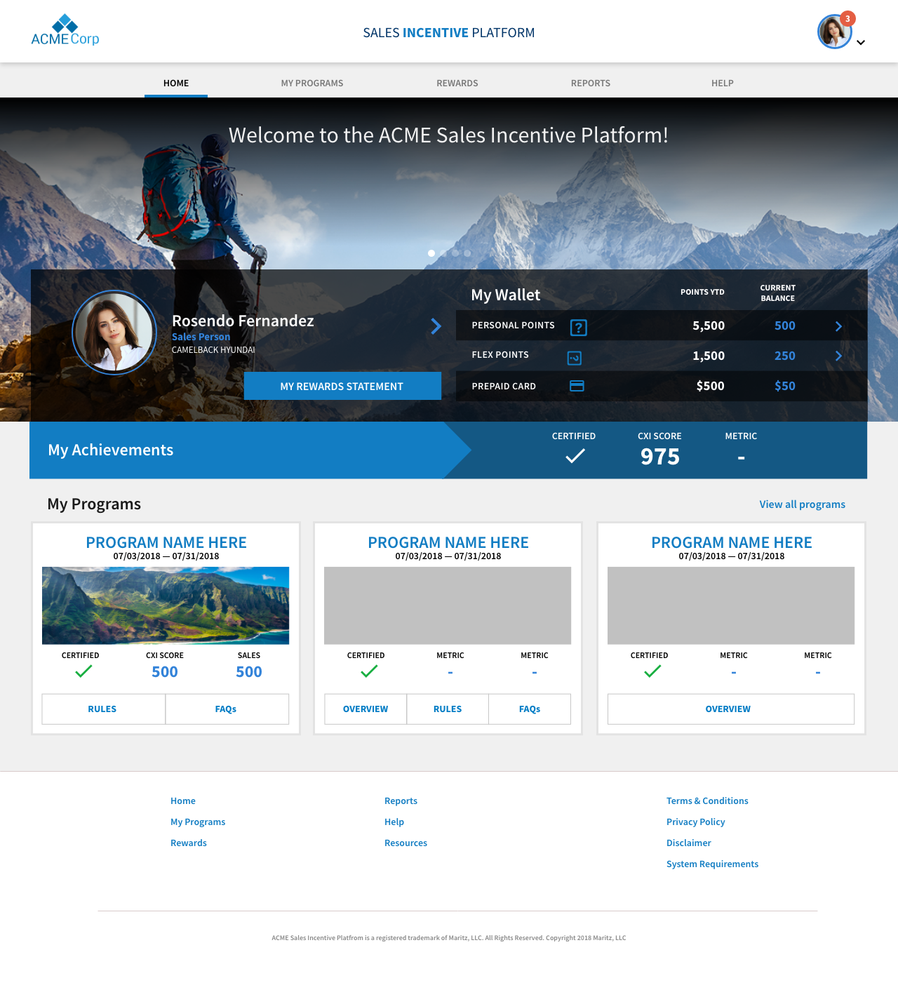
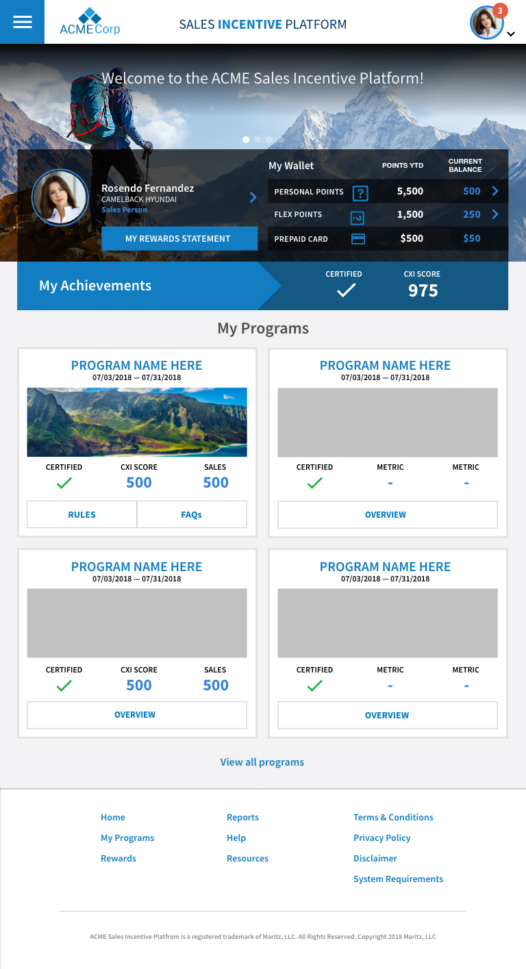
One of the goals of the design system is to ensure that sites/applications are optimal on mobile devices and consistent from one site to another. The best way to ensure sites are properly responsive is to design from a mobile-first viewpoint and then use progressive enhancement for desktop.
Responsiveness
Websites/applications need to be built using a standard grid so they're responsive to fit any device.
- Changes layout based on breakpoints (switch to 4 columns on desktop to 2 columns at tablet size)
- Uses layout classes to manually change layouts based on breakpoint (col-xl, col-lg, col-md, col-sm, col-xs, col-xxs)
- Uses relative units (em, rem, vh, vw) instead of fixed units
- Allows one column to be fixed and the other column to grow/shrink based on screen width (variable widths)
- Allows the layout to adjust regardless of the number of columns
- Uses classes to hide and show content based on breakpoint (hidden-xs, hidden-sm, hidden-md, hidden-lg, hidden-xl, visible-xs, visible-sm, visible-md, visible-lg, visible-xl)


Headers
Mobile devices (tablets and phones) need the ability to show a different header than desktop.
- The header shift from desktop to mobile view takes place at the medium breakpoint (max-width: 959px). This pertains to the portrait tablet view and phones.
- The hamburger shows on the left.
- Header layout can vary based on site needs (utility navigation, site name, etc)
- Headers can be themed (colors, dark vs light)


Menu
Mobile devices require a collapsed menu in order to conserve screen real estate.
- The shift from from desktop to mobile view takes place at the medium breakpoint (max-width: 959px). This pertains to the portrait tablet view and phones.
- Menu is accessible via the hamburger icon.
- Menu shows the client logo and website name at the top on tablets, and the website name only on phones.
- Main navigation shows as individual items, with a right-facing arrow.
- Main nav items with sub navigation function as clickable toggles, which expand when clicking the plus icon and close when clicking the minus icon.
- Menu can be closed by clicking the Close icon at the top.
Images
Images need to be responsive so they can adjust to any screen.
- Responsive Images: Apply class
.img-responsiveto any image to make it automatically adjust based on browser width. - Responsive Backgrounds: Apply class
.bkgrnd-responsiveto any CSS background to make it automatically adjust to the height of its container.
Tables
Tables do not display well on mobile devices. As a result, they should be kept to a minimum and should be reserved for small amounts of content.
- Use layout classes for table columns
.col-#to make sure columns adhere to the grid and adjust based on browser width. - For larger tables, wrap
tablewith class.table-responsiveto allow it to scroll horizontally at smaller screen sizes.
Fonts
Fonts need to resize based on browser width. This traditionally requires the use of media queries to manually change sizing at each breakpoint; however, there may be more modern methods (such as vh/vw) to allow this to happen automatically.
